People often want very basic information about housing and population in specific areas like cities or counties. They want to know the number of children within a community, the level of poverty, the kinds of employment that people are engaged in, or the size and age of housing. Political representation and revenue sharing are allocated based on numbers of persons, and the amount of government spending is often based on the numbers of persons with a given characteristic.
Just acquiring the desired information is often not sufficient. To understand the meaning of the data, the values should be compared to a place of similar size or to a larger summary area such as an entire city, county, state, region, or the United States. This information helps one understand whether the acquired data values are greatly different from those of a much larger population. For example, data for the city of San Francisco could be compared to corresponding values for other cities in California or the State as a whole while values of California could be compared to either other states or national averages.
Furthermore, demographers frequently extract the same information for earlier censuses. In this way they get a sense about whether the current values represent increases or decreases from previous decades.
A. Some Basic Population Data Describing a City
As an example for this exercise we will arbitrarily pick the city of Glendale, California. It has a census place code of 30000.
Glendale |
Los Angeles City |
California |
|
|
Area in Square Miles
|
30.61
|
469.3
|
155,973
|
|
Total Population
|
180,038
|
3,485,398
|
29,760,021
|
|
Males
|
86,606
|
1,750,055
|
14,897,627
|
|
Females
|
93,432
|
1,735,343
|
14,862,394
|
|
Non-Hispanic Whites
|
114,765
|
1,299,604
|
17,029,126
|
|
Blacks
|
2,334
|
487,674
|
2,208,801
|
|
American Indians
|
629
|
15,641
|
242,164
|
|
Hispanics
|
37,731
|
1,391,411
|
7,687,938
|
|
Asians and Pacific Islanders
|
25,453
|
341,807
|
2,845,659
|
|
Persons / Family
|
3.22
|
3.48
|
3.32
|
|
Pop Density per Square Mile
|
5881.5
|
7426.2
|
190.8
|
|
% Male
|
48.1
|
50.2
|
50.1
|
|
% Non-Hispanic White
|
63.7
|
37.3
|
57.2
|
|
% Black
|
1.3
|
14.0
|
7.4
|
|
% American Indian
|
0.3
|
0.4
|
0.8
|
|
% Hispanic
|
21.0
|
39.9
|
25.8
|
|
%Asian and Pacific Islander
|
14.1
|
9.8
|
9.6
|
Glendale is a city of about 30 square miles located just northeast of downtown Los Angeles. Its 1990 population was just over 180,000.
Density - The population density of the city seems high compared to all California, but the state contains large, unsettled areas while most cities do not. Glendale does contain some large areas of mountainous open space so its population density is less than that of neighboring Los Angeles. Density values exceeding 20,000 persons per square mile are found in some neighborhoods of large cities. Density computed this way assumes the population is spread evenly over the sampling area, but this is rarely the case.
Family Size - An important indicator of the number of people in a household is the average number of people per household, but the number of people in an average family is also sometimes used. In Glendale the number of persons per family is slightly lower than the state. This may be a result of an older population, more singles, or the larger white population, a group that tends to have smaller families.
Sex - There are fewer males than females in Glendale and the proportion is lower than for all California. This may be another indicator of an older population in the city since the number of females tends to exceed the number of males in older age groups. Age data could be extracted to confirm this.
Ethnicity - Non-Hispanic whites are the largest group within the city. Expressed as a percentage, non-Hispanic whites constituted about 64% of the population while Hispanics and Asians accounted for 21% and 14% respectively. Compared to the State, Glendale has higher percentages of both whites and Asians and a substantially lower percentage of blacks. If more detailed race data had been used, the relatively larger Korean and Filipino communities within Glendale would have been evident within the Asian and Pacific Islander category.
B. Examining a Characteristic in All Cities - Ranking Places
Often one wants to see how cities rank according to a given characteristic. Once the ranking is done, those cities that have very high or very low values can be examined in more detail to see if reasons can be determined for their position in the ranking.
Densely Populated Places
In the example below, cities have been ranked by population density. State names, area, and total population have been included.
|
State
|
Area in Sq. Mi.
|
City
|
Total Population
|
Density
Pop/Sq. Mi.
|
|
NJ
|
1.27
|
Union City
|
58,012
|
45,822
|
|
NJ
|
1.02
|
West New York
|
38,125
|
37,502
|
|
NJ
|
1.27
|
Hoboken
|
33,397
|
26,243
|
|
CA
|
1.17
|
Maywood
|
27,850
|
23,900
|
|
NY
|
308.95
|
New York
|
7,322,564
|
23,702
|
|
NJ
|
0.96
|
Cliffside Park
|
20,393
|
21,153
|
|
CA
|
1.10
|
Cudahy
|
22,817
|
20,728
|
|
NJ
|
2.88
|
Irvington
|
59,774
|
20,725
|
|
CA
|
0.74
|
Walnut Park
|
14,722
|
20,026
|
|
CA
|
1.15
|
Lennox
|
22,757
|
19,785
|
|
CA
|
1.88
|
West Hollywood
|
36,118
|
19,228
|
|
NJ
|
3.92
|
East Orange
|
73,552
|
18,743
|
|
NJ
|
3.10
|
Passaic
|
58,041
|
18,707
|
|
CA
|
54.10
|
Twentynine Palms
|
11,821
|
218
|
|
OK
|
79.64
|
El Reno
|
15,414
|
194
|
|
NH
|
61.73
|
Berlin
|
11,824
|
192
|
|
MO
|
97.18
|
Fort Leonard Wood
|
15,863
|
163
|
|
FL
|
74.78
|
North Port
|
11,973
|
160
|
|
ME
|
75.75
|
Presque Isle
|
10,550
|
139
|
|
AK
|
1697.65
|
Anchorage
|
226,338
|
133
|
|
VA
|
400.08
|
Suffolk
|
52,141
|
130
|
|
MN
|
181.68
|
Hibbing
|
18,046
|
99
|
|
MT
|
716.18
|
Butte-Silver Bow
|
33,336
|
47
|
|
MT
|
736.94
|
Anaconda
|
10,278
|
14
|
|
AK
|
2593.56
|
Juneau
|
26,751
|
10
|
Cities with the highest densities are usually found in California or New Jersey. With the exception of New York City, these cities tend to be small in area with fairly small populations. All are a part of major urban areas. Probably they contain many apartment units for people who work in nearby Los Angeles and New York.
Examination of the low density cities indicates a problem with calculating density for cities. There is no guarantee that the corporate limit of a city encompasses populated areas. For political reasons the boundary may have been extended far beyond the settled portion of the city. The areas surrounding Juneau and Anchorage, Alaska are such cases.
Ethnic Composition - An Example
The question on race in the U.S. Census is separate from the question on Hispanic origin. People can indicate a particular race such as white, black, American Indian, any of several Asian groups, or other. Then they may indicate if they are or are not of Spanish/Hispanic origin, such as Mexican, Cuban, or Puerto Rican. Many Hispanics indicate their race as white, yet whites are commonly seen as distinct from Hispanics. Thus, tabulations based on the total reported white race are complicated by two distinctly different groups. To compensate for this it is usually better to use the non-Hispanic white category when tabulating data for "whites." This removes those persons of white race who indicated that they also were of Hispanic origin.
In the following table, the percent of the total white population that is also Hispanic has been calculated and ranked. For the entire United States, 5.8% of the white population is white Hispanic. Table 3a below shows the 10 cities with the highest percentages of white race population that are also Hispanic. Most of these cities are on the U.S. - Mexican border, but there are stongly Hispanic places within the Los Angeles and Miami metropolitan areas.
State |
City |
White Race Population |
Hispanic Persons Indicating White Race |
% of White Race Persons that are Hispanic White |
|
United States
|
199,686,070
|
11,557,774
|
5.8
|
|
|
CA
|
Calexico
|
12,628
|
12,212
|
96.7
|
|
CA
|
Florence-Graham
|
11,676
|
11,219
|
96.1
|
|
TX
|
Socorro
|
18,071
|
17,123
|
94.8
|
|
CA
|
East Los Angeles
|
53,330
|
49,833
|
93.4
|
|
TX
|
Eagle Pass
|
11,696
|
10,855
|
92.8
|
|
TX
|
Laredo
|
87,048
|
80,224
|
92.2
|
|
FL
|
Sweetwater
|
10,857
|
9,967
|
91.8
|
|
CA
|
Coachella
|
5,329
|
4,783
|
89.8
|
|
AZ
|
Nogales
|
13,642
|
1,232
|
89.7
|
|
TX
|
Mercedes
|
10,208
|
9,102
|
89.2
|
Table 3b provides this data for cities of 500,000 or more persons. Large cities exhibit a great range in percentage of Hispanics within the entire white population. Obviously the error of using the entire white race population as an indicator for non-Hispanic whites is much more serious in the first half of the list, but only in a few places like Baltimore and Indianapolis are Hispanics so few in number that the entire white race population is a good indicator of the white population as usually understood.
State |
City |
White Race Population |
Hispanic Persons Indicating White Race |
% of White Race Persons that are Hispanic White |
|
TX
|
El Paso
|
396,122
|
260,120
|
65.7
|
|
TX
|
San Antonio
|
676,082
|
336,967
|
49.8
|
|
CA
|
Los Angeles
|
1,841,182
|
541,578
|
29.4
|
|
TX
|
Houston
|
859,069
|
196,427
|
22.9
|
|
CA
|
San Jose
|
491,280
|
103,533
|
21.1
|
|
NY
|
New York
|
3,827,088
|
663,963
|
17.3
|
|
IL
|
Chicago
|
1.263.524
|
207.476
|
16.4
|
|
TX
|
Dallas
|
556,760
|
76,780
|
13.8
|
|
CA
|
San Francisco
|
387,783
|
50,665
|
13.1
|
|
CA
|
San Diego
|
745,406
|
93,671
|
12.6
|
|
AZ
|
Phoenix
|
803,332
|
97,640
|
12.2
|
|
DC
|
Washington
|
179,667
|
13,536
|
7.5
|
|
MA
|
Boston
|
360,875
|
22,141
|
6.1
|
|
LA
|
New Orleans
|
173,554
|
9,028
|
5.2
|
|
MI
|
Detroit
|
222,316
|
10,038
|
4.5
|
|
WI
|
Milwaukee
|
398,033
|
16,316
|
4.1
|
|
OH
|
Cleveland
|
250,234
|
8,682
|
3.5
|
|
PA
|
Philadelphia
|
848,586
|
22,747
|
2.7
|
|
FL
|
Jacksonville
|
456,529
|
10,007
|
2.2
|
|
WA
|
Seattle
|
388,858
|
8,435
|
2.2
|
|
MD
|
Baltimore
|
287,753
|
3,566
|
1.2
|
|
IN
|
Indianapolis
|
554,423
|
4,374
|
0.8
|
|
TN
|
Memphis
|
268,600
|
2,110
|
0.8
|
|
OH
|
Columbus
|
471,025
|
3,673
|
0.8
|
Table 3c indicates the cities in which Hispanics of white race are expressed as percentage of all Hispanics. The last column represents an intriguing phenomenon. Although in the entire United States, 51.7% of the Hispanics indicated their race as white, in these places, Hispanics identified their race as white at much higher percentages. Because many of these places are too small to have local Hispanic communities, it seems likely that these Hispanics are highly acculturated and assimilated into the general white population.
State |
City |
Hispanic Population |
Hispanic Persons Indicating White Race |
% of Hispanic Origin that are Hispanic White |
|
United States
|
22,354,059
|
11,557,774
|
51.7
|
|
|
TX
|
Pecos
|
8,769
|
8,689
|
99.1
|
|
WV
|
Moundsville
|
121
|
117
|
96.7
|
|
FL
|
Kings Point
|
60
|
58
|
96.7
|
|
MI
|
Grosse Pointe Farms
|
72
|
69
|
95.8
|
|
OH
|
Ironton
|
23
|
22
|
95.7
|
|
FL
|
Aventura
|
1,067
|
1,017
|
95.3
|
|
FL
|
Coral Gables
|
16,778
|
15,989
|
95.3
|
|
NJ
|
Holiday City -Berkeley
|
99
|
94
|
94.9
|
|
AL
|
Albertville
|
77
|
73
|
94.8
|
|
OH
|
Tallmadge
|
77
|
73
|
94.8
|
|
NY
|
Hamburg
|
76
|
72
|
94.7
|
|
OH
|
Norton
|
52
|
49
|
94.2
|
|
NJ
|
Hanover Twp.
|
266
|
250
|
94.0
|
|
AZ
|
Sun City West
|
33
|
31
|
93.9
|
|
NY
|
Massapequa Park
|
336
|
315
|
93.8
|
|
AL
|
Alabaster
|
80
|
75
|
93.8
|
|
FL
|
Hamptons at Boca Raton
|
319
|
299
|
93.7
|
|
OH
|
North Canton
|
95
|
89
|
93.7
|
|
FL
|
Olympia Heights
|
29,922
|
27,984
|
93.5
|
|
FL
|
Westchester
|
24,554
|
22,924
|
93.4
|
C. Mapping a Distribution
Whenever one analyzes a large number of census observations, it is often very helpful to also produce a map of the data to see if there are any spatial patterns that may not be apparent in a table. Maps reveal spatial qualities that are rarely evident in statistical tabulations. A researcher may notice that certain places seem to occur near one another when values are sorted in a table, but maps provide this information in detail and at a glance. For example, one can see from Table 2 that many of the densely populated cities are in California and New Jersey, but the table doesn't indicate if these cities are clustered together or linked to certain geographical features such as industrial areas, central cities, or agricultural areas.
Census Geography
To produce maps one needs either a file of the boundaries of the geographic units or a single point for the centroid (spatial center) of the unit. Fortunately, the Census Bureau provides a centroid value in latitude and longitude terms for each of its geographic units. It also publishes the area of these units that can be used to calculate the density of a variable within the unit. The actual boundaries can be obtained in several ways: by using software that will generate them from the street segments in a census TIGER file, by purchasing them from one of several data vendors, or by downloading them (often for free) over the Internet. Usually boundary files provided by data vendors are better in quality than those from other sources. In addition, many geographic information systems (GIS) software packages include boundaries in their sample data for nations, states, counties and ZIP codes.
The size of a statistical area used for analysis can be significant. It is important to realize that the results of analyses are applicable to only the selected units - not to individual people or to units of different sizes. Larger areas mask some of the variability found between smaller areas. Within the state, for example, county rates might vary greatly from that reported for the state and possibly significant differences could be masked if only the state averages are used.
The Census Bureau reports data for blocks, block groups, tracts, counties, states, divisions, and regions. In addition, tabulations are made for places, Congressional districts, metropolitan and rural areas, and various administrative units such as Indian reservations. A block contains about 100 persons, a block group about 1000, and a census tract about 4000. However, there may be a considerable range in these values. In Los Angeles County, census tracts range in value from 0 to over 35,000 persons. The average size is around 5500 persons.
For local area analysis, tracts have long been the preferred areal unit, while at the regional or national level, counties have been used. Within a local area, block-level statistics are occasionally used to compare neighborhoods, but tabulations of data from the sample questions are unavailable for blocks, and so analysis possibilities are more limited.
Mapping Counts and Percents
Examining patterns of counts of population on maps reveals only part of a picture. Such maps indicate where there are more or fewer people, but they may not indicate differences in the relative concentration of one ethnic group compared to another. For example, mapping the number of Hispanics indicates where the numbers are, but one also would expect to find more Hispanics where there are more people. Thus, mapping counts of population components yields maps that are often very much alike. It is usually more valuable to additionally map the percentage of the total population that is Hispanic to reveal where the group is proportionately more concentrated.
Mapping a group by density (i.e. dividing by the sampling unit area) may also be helpful since it readjusts the total population count for the varying areas of the statistical units. A potential problem with mapping population counts is that larger statistical areas generally contain larger numbers of a population.
Although a very large number of mapping styles are possible for portraying statistical information, in practice only a few are used. This is especially true when using computer software, which typically presents few mapping options.
Choropleth Maps
The most common census mapping product is probably the choropleth map. Here the statistical areas are shaded in relation to the data values. The technique is very common with census data because values are reported for statistical units. The values for the areal units are sorted and divided into four to eight classes. Each class is assigned a progressively darker or brighter tone such that a visual order is apparent that approximates increasing magnitude of the values. This would seem a straightforward relationship, but many people assign colors to categories in an almost random way. An alternative approach is to use a bi-variate color scheme that uses two hues that progressively darken as values depart from an average or selected base value. For example, one might create employment categories that become more brown for counties in those categories that are below the state average. Employment categories above the state average might be in shades of a progressively darker green.
A real challenge in choropleth mapping is to decide on an appropriate number of classes and on a method for selecting class breaks. There is no simple answer to this problem. As a rule of thumb the method proposed by George Jenks (the default method and currently misnamed "natural breaks" in ArcView) would be preferable to others. This method seeks to minimize variation between values within the classes. In many situations, especially when a number of maps are to be compared, quantile breaks are appropriate. An alternative method occasionally used is to compute the mean of the distribution and to create class breaks based on standard deviation values about the mean.
On choropleth maps data should be expressed as a ratio, index, percentage, or density. Such maps are not appropriate for showing counts of people. This is because large areas tend to appear in higher classes not because of any characteristic, but because larger areas encompass a greater portion of a population distribution. Obviously Texas will have more people than Oklahoma because it covers more area.
Another concern with the difference in size of areal units on choropleth maps is that larger areas will visually dominate on the map and many of these are in rural areas with small populations. Such large areas call undue attention to themselves on the map. On the otherhand, large populations occur in very small areas such as the boroughs of New York or in Washington D. C. and might not be noticed by map readers. An inset map can be helpful in drawing attention to some of these smaller areas if they are not discernible on a map of a large area such as the entire United States.
Graduated Symbol Maps
A second method often found in census mapping is graduated symbols. With this approach the area of a circle or square is made proportional to the value of an attribute. Graduated symbols may be used for point features such as cities and may represent counts of things. A frequent problem with this technique is that the range of values far exceeds the range that can be effectively presented on the map. Thus, it may be necessary to set a lower limit to be displayed. Values below the threshold are either not shown or are assigned a standard symbol. An alternative strategy available in some programs is to define a set of groups and then assign a single symbol size to all values falling within the range of a given group. This method, referred to as "range-graded symbols" is somewhat like the classification scheme used for the choropleth map.
Dot Maps
A third method is the dot map, a technique that requires the assignment of a given number of individuals to a dot. The dot is then located to represent the approximate location of a group of individuals. When done manually, additional maps and aerial photographs may be used to help determine the appropriate dot placement. It also permits the overlay of multiple distributions on the same map by using dots of different shapes or colors.
Unfortunately, computer programs can only locate the dots randomly within a statistical area. The patterns only begin to become meaningful when statistical areas as shown on the map are very small. In other cases, the look of the distribution can be improved by moving the map to a graphic arts program where dots can be moved individually away from unpopulated areas within the statistical units.
Mapping with ArcView
The California State University currently has a site-license for ESRI software that includes a mapping/GIS package called ArcView. This package, or any other, can be used to produce choropleth, graduated symbol, and dot maps from census data. Appendix M gives an explanation of the use of ArcView.
Mapping Cities with High Population Density
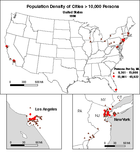
In the example below, population densities used for Table 2 have been mapped. To focus on the most densely populated cities, the frequency distribution of cities was divided equally into 20 classes. The top class was split in two. Thus, only the top 5 percent of the cities are presented. Note that most of the cities cluster around New York and Los Angeles. To better examine these areas, look at the two large-scale inset maps. (Two new Views were produced at large scale and added to the Layout Window.)


